Richard’s
Company:
Bex Brands
Art Direction:
Jeremy Dahl, Becky Dahl and Ian De Lemos
Client:
Richard’s Rainwater
Role:
Logomark design, brand visual direction, brand guidelines, website design and package design
Richard’s is revolutionary in the water industry.
They are recycling earth’s most natural source of water, and making it safe to drink. Completely ethical, completely genius. Not surprisingly, they wanted a brand identity that captured the excitement of what they are doing!—changing the way the world drinks water.
Designing the Logomark
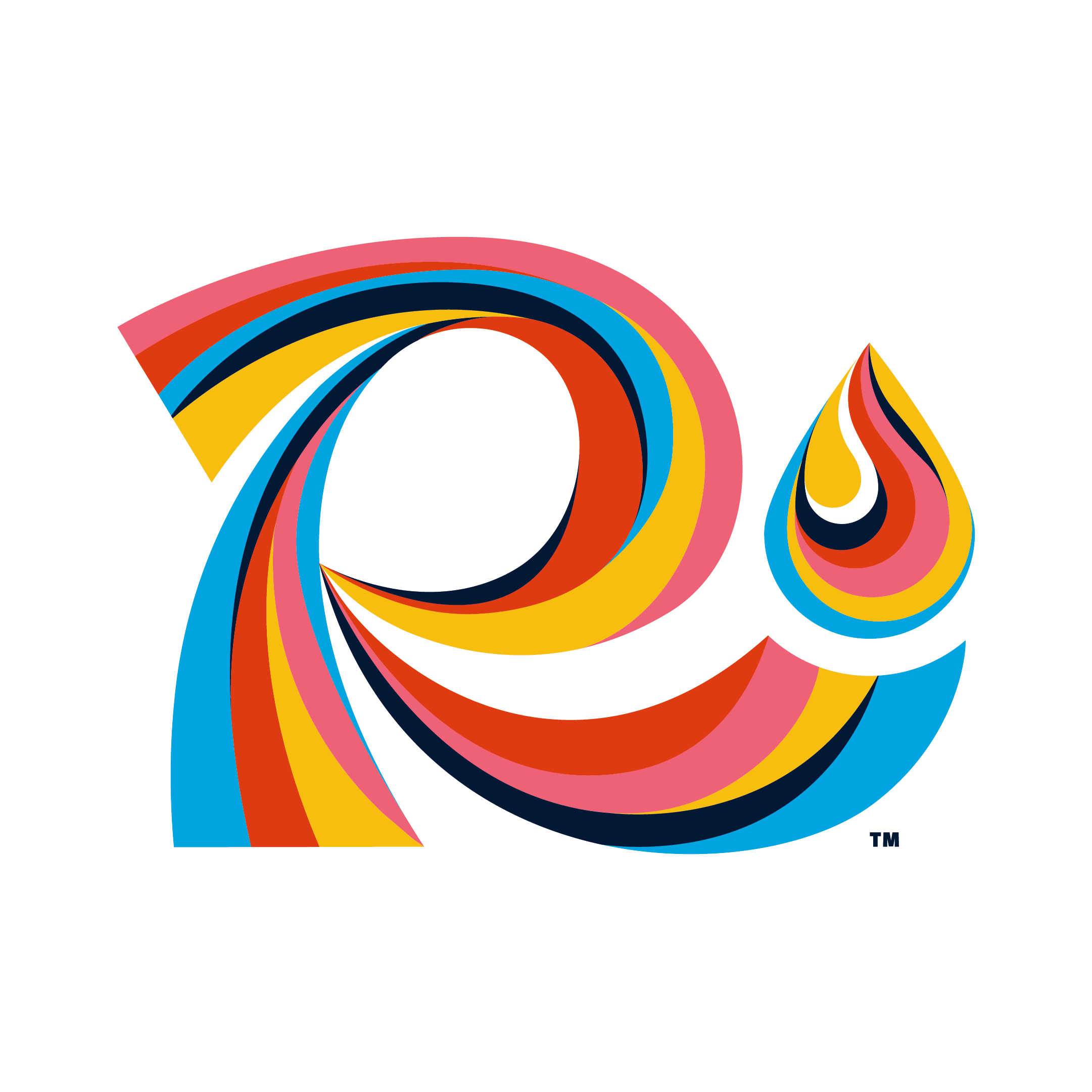
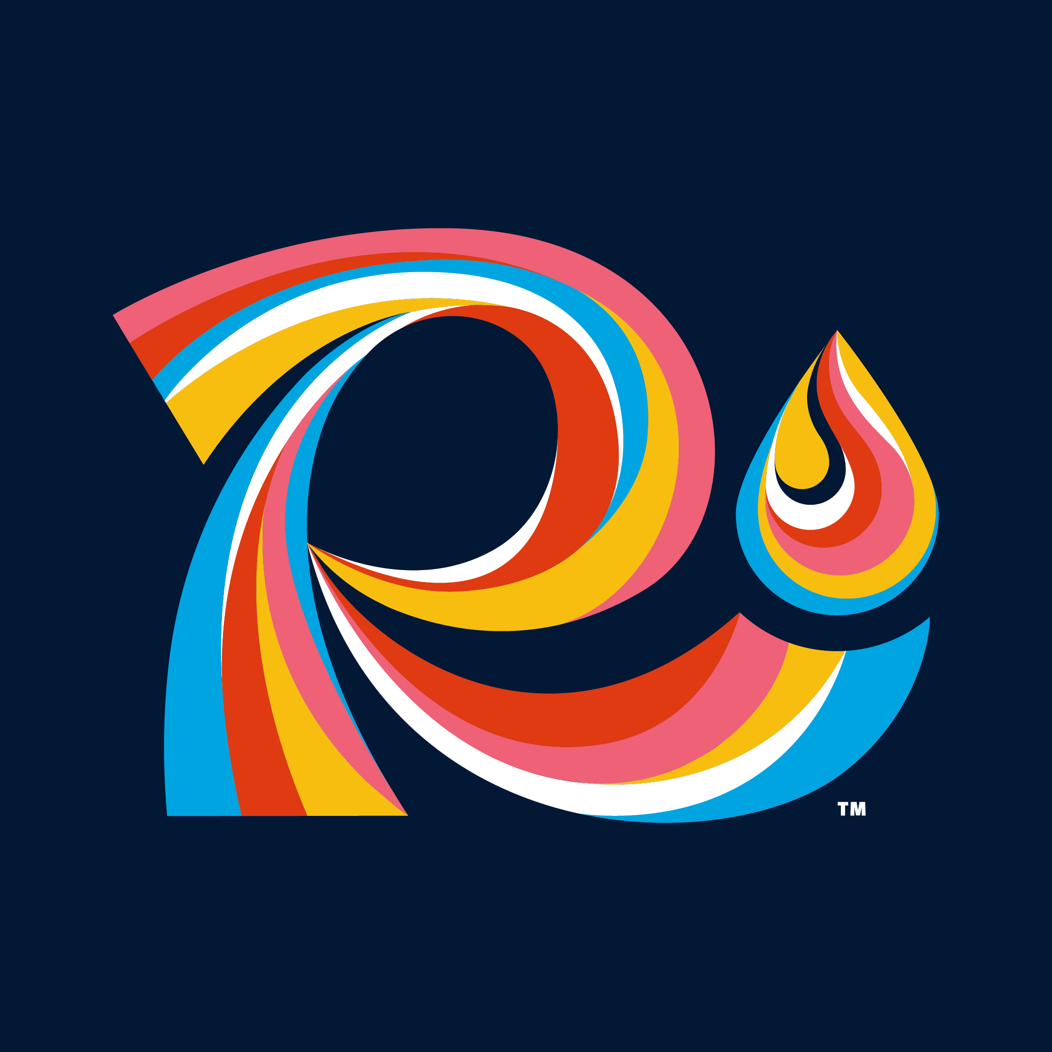
The client wanted to pay homage to the memory of being a kid, tilting your head back and catching rain on your tongue. To achieve that feeling, I created a retro yet modern and trendy mark made up of separate segmented rainbow shapes with undulating stripes. The foot of the R thoughtfully catches a raindrop.
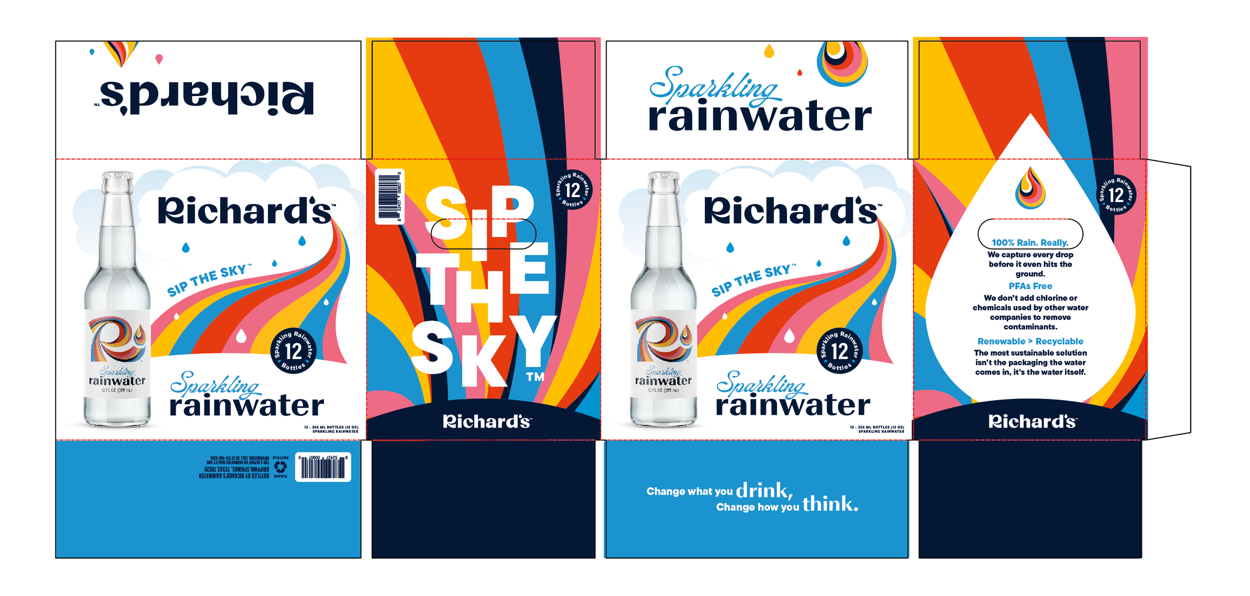
Designing the Packaging
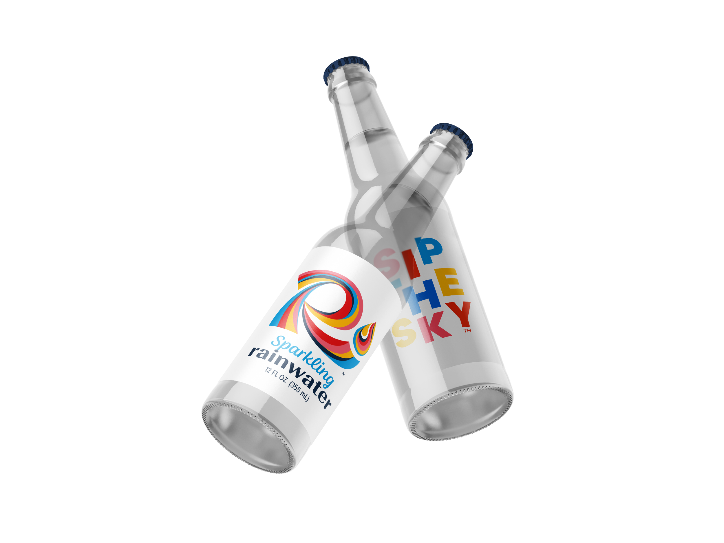
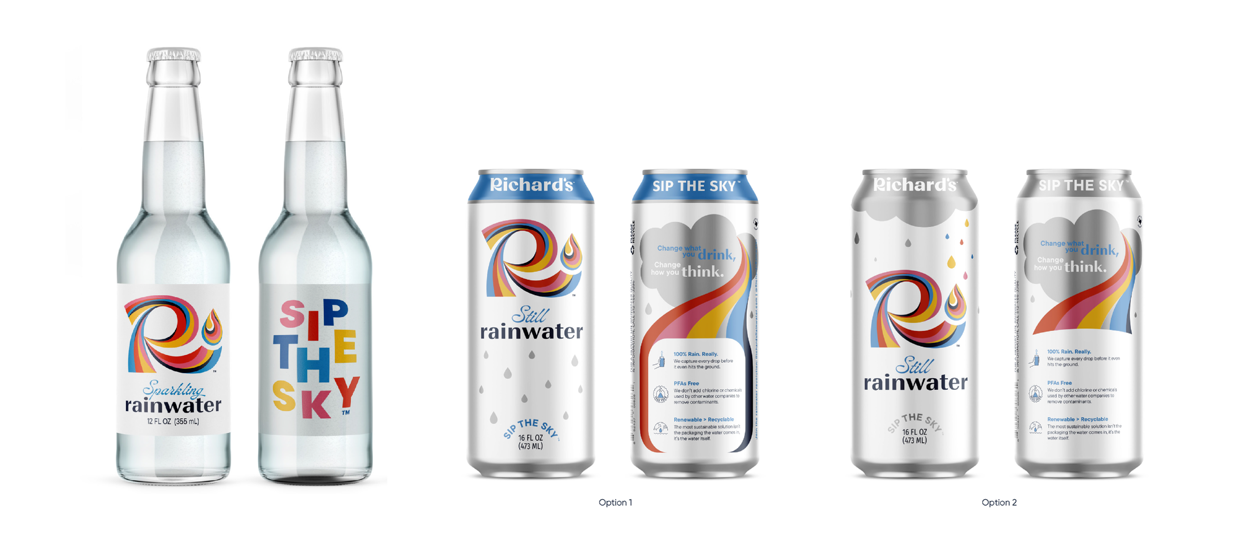
After establishing the logomark and direction, it was time to design the packaging. I kept the label design on the sparkling bottle simple to let the R shine, and chose to get more expressive on the can and box with a full rainbow illustration, hoping to excite the consumer and entice them to take this colorful journey into the sky.
The story of Richard’s
The last step of this branding process was to create an infographic outlining the story and process of how Richard’s takes fresh, clean caught rain and turns it into a crispy, delicious and better for the planet drinking water that you can feel good about.
Sip the Sky
•
Sip the Sky •
So, have you ever sipped the sky?
