THE PROCESS
Naming the Brand
In the naming process for this brand, my client provided several key suggestions and criteria. They aimed for a name that conveyed luxury and sophistication, reflected their Asian influences from years spent in the region, and remained elegantly simple.
I dedicated several hours to researching words related to the sea in various languages, including Bahasa Indonesia, Tagalog, Bahasa Melayu, and other South Asian tongues. Ultimately, I discovered the name "Sirena," inspired by a Philippine mythological sea creature with the head of a human and the body of a fish. A mermaid, DUH. We went with that.
Designing the Logo
I sent 3 options over to the client for the first round of review. Each option had hidden mermaid tails in the lettermarks for an added touch of whimsy and to emphasize the mermaid theme.
Option 1
A highly customized font. There are 4 hidden mermaid tails in this option. Can you spot them all?
The flow of the composition suggests a sea-like nature, tells the story of a mermaid swimming as it takes your eye up and down with the interaction of the ligatures, and emphasizes the friendliness and approachability of the brand while still feeling high-end. I chose to make the ‘E’ smaller than the rest of the letters to give the ‘R’ room to shine, but also to act as an accent both vocally as visually.
Option 2
A more modern approach. I used a trending, free use font and tweaked a few of the ligatures with thoughtful tracking/kerning to create a more regal and serious composition.
There is one hidden tail in this option, making it the focal point of the logo. The ‘S’ is reminiscent of a mermaid tail and body as it wraps around itself, and the ‘L’ in “La” is slightly shorter than the ‘S’ to further emphasize the focal point. I also felt the pointed ‘e’ is reminiscent of a trident spike or tiara.
Option 3
The most friendly and approachable option in my opinion, with the tails being the most obvious compared to the other iterations. I also felt this option had the best story.
The ‘S’ exudes a playful spirit, and represents two mermaids interacting, playing and enticing sailors. The star on the ‘i’ adds charm and whimsy, but also suggests a representation of the North Star, which sailors used to guide them across the dark seas. This option also included all 3 customized details in the “LS” logomark.
The Final Logo
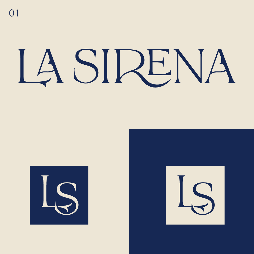
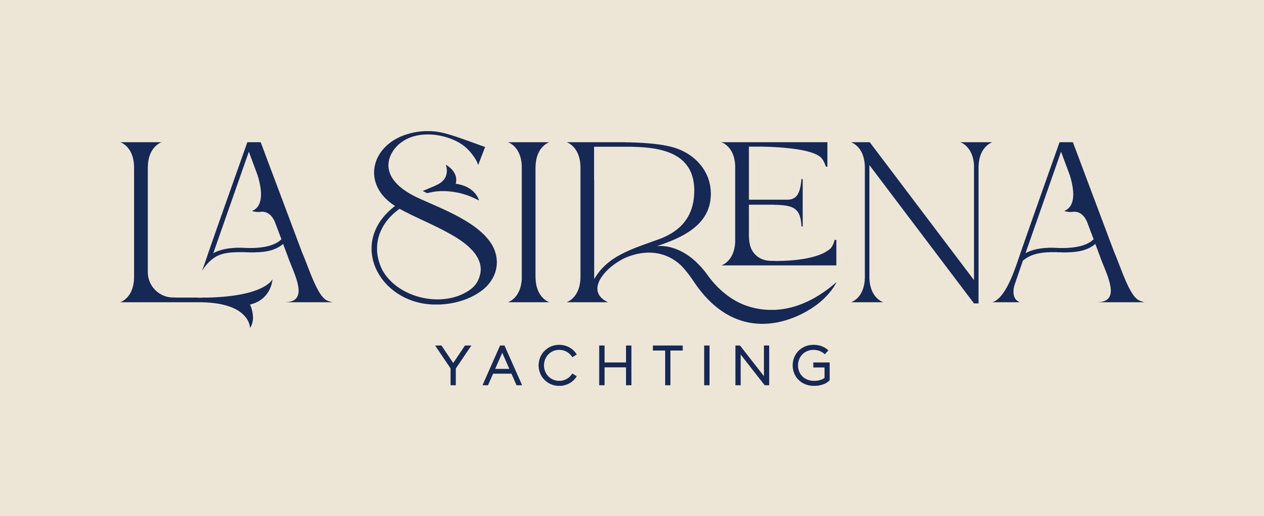
The client loved all three options, but we settled on Option 1 with the addition of the ‘S’ from Option 2.
I refined the design by cleaning up the lines and ensuring consistent curves throughout the logo. Additionally, at the client’s request, I added “yachting” as a secondary line.
Illustrating La Sirena
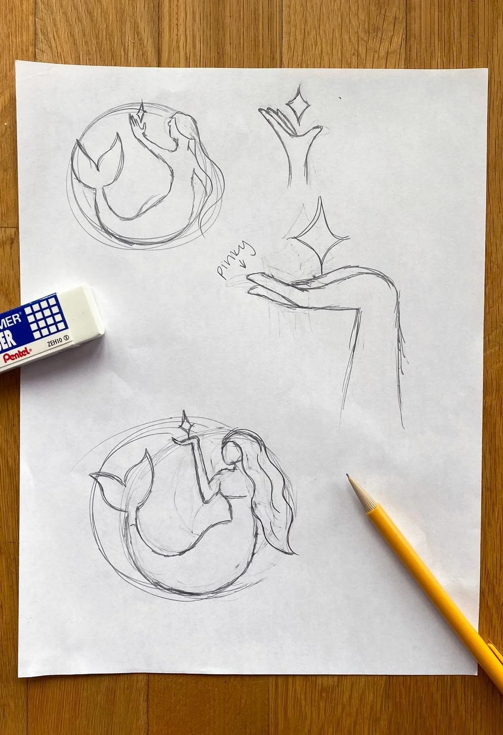
Next, I was tasked with creating a mascot/logo for La Sirena. The client requested a full mermaid illustration—family-friendly and simple, without too much detail. I wanted to incorporate a North Star motif, so I began sketching different ways the mermaid could interact with the star. The client also mentioned that the logo would be displayed on a 15-foot sail of their catamaran, so it needed to be both eye-catching and impressive. Most importantly, they emphasized that the design had to remain legible from a distance, as well as adaptable for various marketing materials, whether scaled up or down.
Final Options
Once I had locked in two mermaid comps I liked best I rendered both of them on illustrator, paired them with the finalized wordmark and sent them over to the client for review and a final round of edits.
Option 1
A more youthful and curious pose/silhouette—the mermaid is looking up at the North Star in wonder and awe. Thoughtful breaks in the design lend movement, while being pronounced enough that they won’t get lost when sized down. Was important to the client that this icon could be embroidered easily. The curves from the star are taken from the consistent curves on the feet in the wordmark.
Option 2
A more maternal and trusting pose—the mermaid in this composition is oriented inward, emulating a more nurturing and safe position so guests feel they are in good hands. She is looking at the star more confidently than the mermaid in option 1, further noting the trustworthiness and protection that could be expected from a cruise on La Sirena.
THE FINAL BRAND IDENTITY


